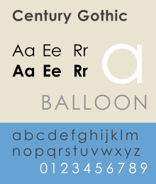
Century Gothic
 | |
| Category | Sans-serif |
|---|---|
| Classification | Geometric |
| Foundry | Monotype |
| Date created | 1991 |
| Design based on | Twentieth Century |
Century Gothic is a sans-serif typeface in the geometric style, released by Monotype Imaging in 1991.[1][2] It is strongly influenced by the font Futura, though with a higher x-height, and its design history also derives from two separate typefaces intended as Futura competitors. It is a digital typeface that has never been made into actual foundry type.
Contents
1 Design
1.1 Sources
1.2 Design characteristics
2 Printer ink usage
3 Related fonts
4 Selected usages
5 References
6 External links
Design
Like many geometric sans-serifs, Century Gothic's design has a single-story "a" and "g", and an "M" with slanting sides resembling an upturned "W". Century Gothic has a high x-height (tall lower-case characters). Its origins (see below) come from a design intended for large-print uses such as headings and signs, and so it has a reasonably purely geometric design closely based on the circle and square, with less variation in stroke width than fonts designed for small sizes tend to show, and a relatively slender design in its default weight.[3] Its default spacing is quite tight in the style popular in American post-war display typefaces. Characters are quite wide; Monotype have described it as a "spacious" design.[2]
Sources
While many geometric sans-serif typefaces have been released to compete with the popular typeface Futura, Century Gothic is perhaps unique in its origin: it redraws one to match the design proportions of a second. Century Gothic was created to be a substitute font for ITC Avant Garde, designed by Herb Lubalin, and released by the International Typeface Corporation (ITC) in 1970, so a document created in one can be displayed in the other with no change to copyfit.[4][5] This allows it to substitute interchangeably for Avant Garde in documents, an important feature since Avant Garde is a standard font in some forms of the PostScript digital printing standard, and so Century Gothic allowed Microsoft to use it in preference to paying for an ITC Avant Garde license.
Additionally, Century Gothic's design was based on Monotype's own Twentieth Century, which was drawn by Sol Hess between 1937 and 1947 for the Lanston Monotype Company.[6] Century Gothic is similar to ITC Avant Garde in its pure geometry, and does not possess the subtle variation in stroke width found in either Futura or Twentieth Century.[7] However, it differs from ITC Avant Garde in that like Futura and Twentieth Century, Century Gothic does not have a descender at bottom right of the "u" (making it appear like a Greek upsilon υ), whereas Avant Garde does. Century Gothic also has larger, rounder tittles on the letters i and j, whereas Avant Garde keeps the tittles square and the same width as the letter strokes. Most notably, it lacks the extreme stylistic alternates of Avant Garde, such as highly slanted letters designed to fit together closely in kerning.[8]
Design characteristics

Twentieth Century (above) and Century Gothic (below) at equalised x-height in their default weight. Twentieth Century has features for smaller text such as loose spacing and a solid stroke weight that narrows where curves join the verticals. Century Gothic has a finer structure, less variation in stroke width and sometimes wider characters, and by default tighter spacing.
ITC Avant Garde was intended as a display design for large headings and advertisements (although it is somewhat usable for body text because of the high x-height) and as a result Century Gothic is quite a light typeface, especially in default weight, with the classic display typeface feature of tight spacing and quite wide characters, in contrast to Twentieth Century which was intended more for small-size applications with a more solid stroke weight and open spacing.[9] While its structure is similar to Futura, its regular style is between Futura and Twentieth Century's regular and light weights.
Century Gothic was one of several clones of PostScript standard fonts created by Monotype in collaboration with or sold to Microsoft around this time, including Arial (a clone of Helvetica), Book Antiqua (Palatino) and Bookman Old Style (ITC Bookman).[10][11] It was bundled with Microsoft Office 4.3 in 1994 and subsequently provided with Plus! 95, Windows 98, Microsoft Works, and various versions of Microsoft Office up to 2010.[12] A version of Century Gothic, Levenim, that includes Hebrew alphabet characters has been included in later versions of Windows.
Printer ink usage
According to the University of Wisconsin-Green Bay, Century Gothic uses much less ink than other, similar sans-serif typefaces. It was found that Century Gothic uses about 30% less ink than Arial. In order to save money that would be spent on printer ink for other typefaces, the university reportedly switched their default e-mail and printing typeface from Arial to Century Gothic.[13] However, the typeface has also been found to use more paper—due to its wider letters—meaning that the savings on ink are offset by an increase in paper costs.[14]
Along with the serif typeface Garamond, Century Gothic is one of the two typefaces that PrintWise, an initiative of the U.S. government's General Services Administration, recommends U.S. government workers use for printed documents.[15][16]
Related fonts
Apart from Avant Garde and Futura, a number of other fonts based on Avant Garde have been created to substitute for it in PostScript implementations. A particular case of this is an open-sourced set of fonts developed by URW and donated to the Ghostscript project to create a free PostScript alternative. This includes an AvantGarde clone known as "Gothic L". It (or a derivative) is used by much open-source software such as R as a system font.[17][18] A derivative of this family known as "TeX Gyre Adventor" has been prepared for use in the TeX scientific document preparation software.[19]
Selected usages
- The standard title typeface in Key Club publications.
- Heavily used in the standing sets of Star Trek: Enterprise as part of the Starfleet standards for that television series' stated time period of the 2150s.
- The logo of the Canadian music duo Crystal Castles.
- The main typeface of The Ellen DeGeneres Show.
- The main typeface of EA's third-person shooter, Battlefield Heroes.
- The logo of GMA Network.
- The logo of King Power.
- The logo of Arca South.
- The logo of Samsung ATIV.
Weezer's "weezer" logo.- The cover of Gorillaz' 2005 album Demon Days.
- The main typeface for the video game BioShock.
- Used briefly throughout the Jak and Daxter video game series.
- The beginning and end credits in the US television series House.
- The opening titles and the credits of The Hunger Games.
- The default typeface on the 2012 Summer Olympic Games medallions.
- The band Franz Ferdinand's logo.
- One of the lower thirds graphics for Fox News Channel.
- The text in Point Blank as in keyboard.
- The main typeface of the video game Civilization V.
- The interface typeface of the computer game SimCity 5.
- The console typeface in the video game The Elder Scrolls III: Morrowind.
Victoria School uses this typeface as their official typeface for letters and other print material.- The main typeface for the Greek Fanzine "Aglaea"
- Used in the Six Flags Logos for the actual park names under or after the Six Flags logo in the late 1990s through mid-2000's.
- Used in Disney Parks logos for the word's "land" or "world" after the Walt Disney handwriting logo "Disney" in the late 1990s through most of the 2000s.
- The English font used in the Studio Ghibli logo.[20]
- The font of British electronic music duo Autechre use Century Gothic or Avant Garde in their logo, occasionally with greatly reduced letter spacing.[21]
CNN Philippines The Source Logo
References
^ "Geometric fonts". Linotype. Retrieved 9 May 2016..mw-parser-output cite.citation{font-style:inherit}.mw-parser-output q{quotes:"""""""'""'"}.mw-parser-output code.cs1-code{color:inherit;background:inherit;border:inherit;padding:inherit}.mw-parser-output .cs1-lock-free a{background:url("//upload.wikimedia.org/wikipedia/commons/thumb/6/65/Lock-green.svg/9px-Lock-green.svg.png")no-repeat;background-position:right .1em center}.mw-parser-output .cs1-lock-limited a,.mw-parser-output .cs1-lock-registration a{background:url("//upload.wikimedia.org/wikipedia/commons/thumb/d/d6/Lock-gray-alt-2.svg/9px-Lock-gray-alt-2.svg.png")no-repeat;background-position:right .1em center}.mw-parser-output .cs1-lock-subscription a{background:url("//upload.wikimedia.org/wikipedia/commons/thumb/a/aa/Lock-red-alt-2.svg/9px-Lock-red-alt-2.svg.png")no-repeat;background-position:right .1em center}.mw-parser-output .cs1-subscription,.mw-parser-output .cs1-registration{color:#555}.mw-parser-output .cs1-subscription span,.mw-parser-output .cs1-registration span{border-bottom:1px dotted;cursor:help}.mw-parser-output .cs1-hidden-error{display:none;font-size:100%}.mw-parser-output .cs1-visible-error{font-size:100%}.mw-parser-output .cs1-subscription,.mw-parser-output .cs1-registration,.mw-parser-output .cs1-format{font-size:95%}.mw-parser-output .cs1-kern-left,.mw-parser-output .cs1-kern-wl-left{padding-left:0.2em}.mw-parser-output .cs1-kern-right,.mw-parser-output .cs1-kern-wl-right{padding-right:0.2em}
^ ab "Century Gothic". Fonts.com. Retrieved 9 May 2016.
^ Phinney, Thomas. "Comments on Quora". Quora. Retrieved 9 May 2016.Century Gothic is fine for large sizes. It is poor for body text. Assertions that its high x-height "means it has good legibility" are incorrect. An ample x-height within reason contributes to legibility. But Century Gothic also has very closed apertures on key characters that make them hard to distinguish from others. Its extreme geometric design does not help.
^ Simonson, Mark. "Monotype's Other Arials". Mark Simonson Studio. Retrieved 14 July 2015.
^ Gavin Ambrose; Paul Harris (1 November 2006). The Fundamentals of Typography. AVA Publishing. p. 145. ISBN 978-2-940373-45-1.
^ David Kadavy (8 August 2011). Design for Hackers: Reverse Engineering Beauty. John Wiley & Sons. p. 298. ISBN 978-1-119-99901-0.
^ Coles, Stephen. "Alternatives to Futura". Fontshop. Archived from the original on March 16, 2015. Retrieved 2 October 2015.
^ "Avant Garde Gothic Alternates Are Back". Font Feed. FontShop. Retrieved 9 May 2016.
^ Shaw, Paul. "The Kerning Game". Print magazine. Retrieved 9 May 2016.
^ Simonson, Mark. "The Scourge of Arial". Mark Simonson Studio Notebook. Retrieved 19 March 2016.
^ Downer, John. "Call It What It Is". Emigre. Retrieved 20 March 2016.
^ "Century Gothic - Version 2.35". Microsoft.
^ "Wis. college says new e-mail typeface will save money". Archived from the original on April 6, 2010.
^ Ramde, Dinesh (April 7, 2010). "Century Gothic a font of wisdom". Twincities.com. Retrieved 2014-04-01.
^ "PrintWise". Strategic Sourcing. General Services Administration. Retrieved 2014-04-01.
^ Stix, Madeleine (March 28, 2014). Teen to gov't: change your typeface, save millions. CNN via KOCO-TV. Retrieved March 28, 2014.
^ "Fonts". R Cookbook. Retrieved 7 April 2016.
^ Horton, Nicholas. "Specifying fonts in graphics". SAS & R. Retrieved 7 April 2016.
^ "URW Palladio". The LaTeX font catalogue. TeX Users Group Denmark. Retrieved 7 April 2016.
^ "What is the font for the Studio Ghibi logo? : ghibli". reddit.com. Retrieved 15 December 2016.
^ "Logo #152: Autechre". Retrieved 20 January 2016.
External links
 Media related to Century Gothic at Wikimedia Commons
Monotype typefaces | |
|---|---|
| 1900s |
|
| 1910s |
|
| 1920s |
|
| 1930s |
|
| 1940s |
|
| 1950s |
|
| 1960s |
|
| 1970s |
|
| 1980s |
|
| 1990s |
|
| 2000s |
|
| 2010s |
|


